
2. Color & Pattern: Setting the Visual Tone
Light neutrals (soft whites, creams, pale grays) reflect light, make spaces feel larger, and hide dust well.
Dark tones (charcoal, navy, deep terracotta) add drama and sophistication but show water spots and crumbs more easily.
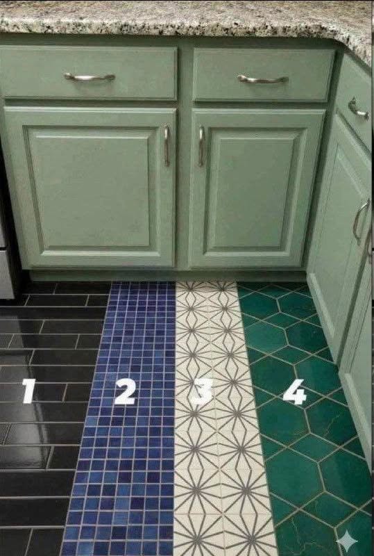
Patterned tiles (encaustic, geometric, checkerboard) act as built-in art. Best used in moderate-traffic zones or balanced with simple cabinetry.
Wood-look planks bring warmth and continuity, especially in open-concept homes where flooring flows into living spaces.
💡 Design tip: If your kitchen features bold countertops or statement cabinets, choose a quieter floor. If your cabinetry is neutral, let the floor take center stage.
3. Texture & Finish: How It Feels (and Performs)
The finish dramatically impacts both aesthetics and safety:
Finish
Look & Feel
Kitchen Suitability
Matte/Honed
Soft, non-reflective, natural
✅ Excellent: hides scratches, slip-resistant, easy to maintain
Polished
High shine, reflective, luxurious
⚠️ Use cautiously: shows footprints, can be slippery when wet
Textured/Embossed
Tactile surface, rustic or artisanal
✅ Great for slip resistance; may trap dirt in grooves
Structured/Anti-Slip
Designed for traction (COF ≥ 0.42)
✅ Ideal for busy kitchens, families, or wet zones
4. Size & Format: Proportion Matters
Large format (24″x24″ or larger): Minimizes grout lines, creates seamless flow, ideal for modern or open layouts.
Plank tiles (6″x24″ or 8″x48″): Mimic hardwood, elongate narrow kitchens, work well in diagonal or herringbone layouts.
Small format/Mosaic (1″x1″ to 3″x6″): Adds detail, ideal for backsplashes or accent zones; too much on floors can feel busy.
Layout patterns: Straight stack (clean, modern), running bond (classic), herringbone/chevron (dynamic, high-end), diagonal (expands space visually).
5. Grout: The Unsung Design Hero
Grout isn’t just functional—it’s a design element.
Matching grout creates a seamless, monolithic look.
Contrasting grout highlights patterns (think classic black-and-white checkerboard).
Epoxy or urethane grout resists staining, mold, and moisture—ideal for kitchens.
Width matters: Narrow grout lines (1/16″–1/8″) feel modern; wider lines (1/4″+) lean traditional or artisanal.
🎨 Matching Tile to Your Kitchen Style
Kitchen Aesthetic
Recommended Tile Choices
Why It Works
Modern/Minimalist
Large-format matte porcelain, neutral tones, thin grout lines
Clean lines, visual calm, easy maintenance
Farmhouse/Cottage
Wood-look planks, soft encaustic patterns, honed stone finishes
Warm, inviting, subtly rustic without feeling dated
Traditional/Classic
Marble-look ceramic, checkerboard cement, polished or honed finishes
Timeless elegance, pairs well with detailed millwork
Coastal/Bright
Light ceramic, sea-glass tones, subtle texture, wide-format planks
Airy, reflective, complements natural light
Eclectic/Boho
Patterned cement, mixed textures, bold terracotta or jewel tones
Expressive, layered, celebrates craftsmanship
⚖️ Practical Considerations: Beauty Must Meet Function
A kitchen floor faces spills, dropped utensils, heavy foot traffic, and frequent cleaning. Style alone isn’t enough.
✅ Must-Have Performance Traits:
Slip resistance: Look for a Coefficient of Friction (COF) of 0.42 or higher for wet areas.
Water & stain resistance: Porcelain and sealed natural stone outperform unsealed materials.
Impact resistance: Kitchens drop things. Choose tiles rated for residential/commercial use (PEI III–IV).
Easy maintenance: Matte finishes and epoxy grout reduce cleaning time and hide wear.
Thermal comfort: If you stand for long periods, consider radiant floor heating compatibility (works beautifully with porcelain and stone).
💰 Budget vs. Long-Term Value:
Entry-level: Ceramic ($2–$5/sq ft) + standard installation
Mid-range: Quality porcelain ($4–$8/sq ft) + upgraded grout
Premium: Natural stone or designer patterns ($8–$15+/sq ft) + professional layout
Invest wisely: Floor tile is difficult and costly to replace. Prioritize durability and timeless appeal over fleeting trends.
☀️ How Lighting & Space Size Influence Your Choice
Factor
Recommendation
Small kitchen
Light colors, large format, minimal grout lines, diagonal layout to draw the eye outward
Dark or windowless kitchen
High-reflectance matte or lightly polished tiles, light grout, avoid heavy patterns that absorb light
Abundant natural light
You can safely use darker tones, bold patterns, or textured finishes without shrinking the space
Open-concept layout
Match or complement adjacent room flooring for visual flow; use transition strips only where necessary
📋 Step-by-Step Tile Selection Checklist
Assess your lifestyle: Pets, kids, cooking frequency, and cleaning habits dictate durability needs.
Define your style: Pull inspiration from your cabinets, countertops, and overall home aesthetic.
Test samples in your space: Lighting changes everything. Place samples on the floor at different times of day.
Check slip & durability ratings: Verify COF, PEI rating, and water absorption rates.
Plan your layout: Sketch how tiles will align with cabinets, appliances, and doorways.
Choose grout strategically: Match for seamlessness, contrast for pattern emphasis, and select stain-resistant formula.
Hire experienced installers: Tile is only as good as its installation. Proper leveling, spacing, and sealing are critical.
💙 Final Thoughts: The Floor That Grounds Your Home
Choosing kitchen floor tile isn’t just about picking a color or pattern. It’s about selecting a foundation that will support your daily life, reflect your personal style, and quietly elevate every moment spent in the room.
When design, texture, and material align with function, your floor stops being just a surface. It becomes part of the kitchen’s soul.
Take your time. Test samples. Prioritize what you’ll live with every day—not just what looks good in a magazine. Because the right tile doesn’t just transform your kitchen.
It transforms how you experience it.
ADVERTISEMENT

